Introduction
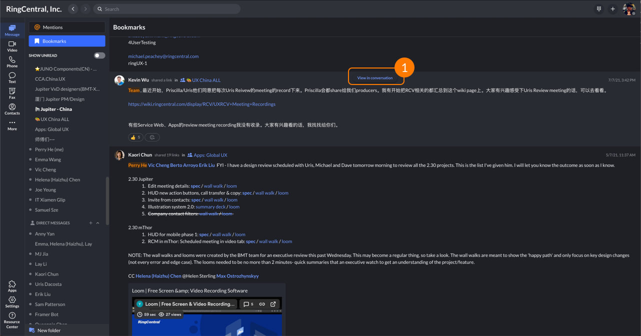
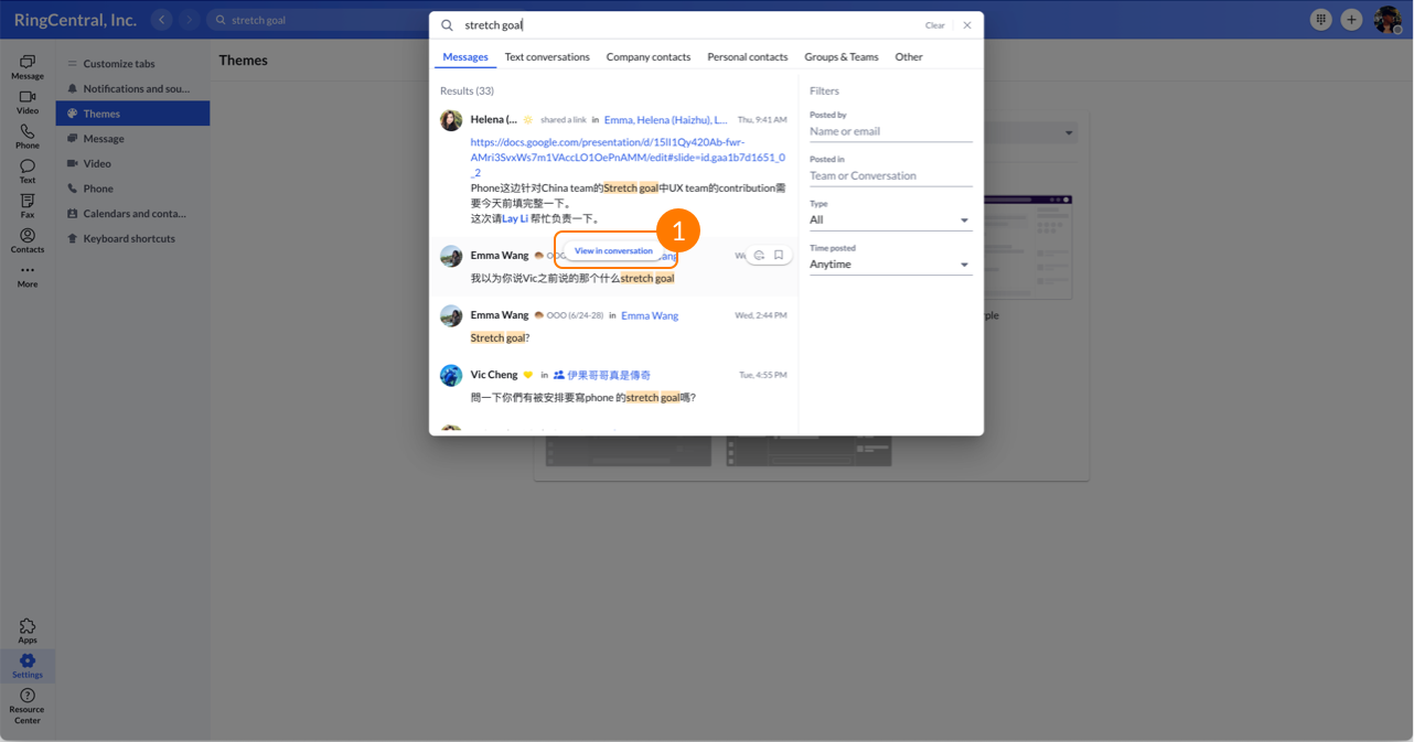
View In Conversation is a frequently used function that allows user jump to the related conversation quickly, it exist in many pages such as Bookmark, Mentions, Global search.
My Role
Design lead
Launch Date
May, 2021
View In Conversation
Take learning from user feedback and analytics team it's important for us to improve the UX, but sometimes we also need voice from internal team. So this time, we listened:
1. The View post in conversation button is easily missed as it’s far away from the top left of the pill where the metadata is (especially hard to spot on a large monitor).
2. The View post in conversation button is blended and difficult to spot in dark mode.
3. The View post in conversation button overlaps other clickable area and make it difficult to click.
Where is the problem?
1. The button is blended and difficult to spot in dark mode.
1. Overlaps with other clickable area and make it difficult to click.
Key Motivation
1. Customer feeback.
2. Internal feedback.
Pains
1. It’s not straightforward and takes time to find how to view a post in a conversation.
Relievers
1. Provide an easier way to view post in conversation.
Draft design
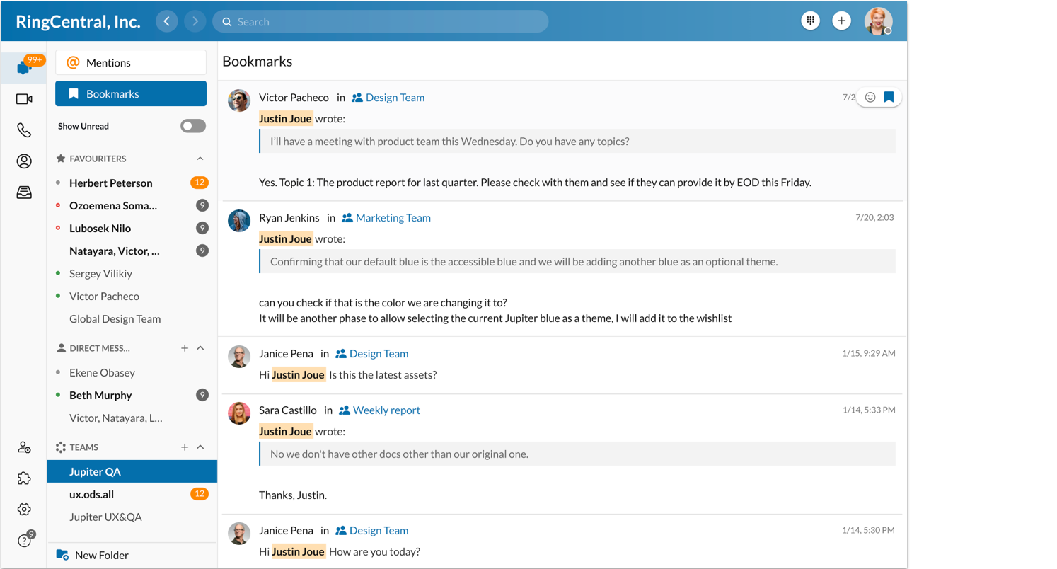
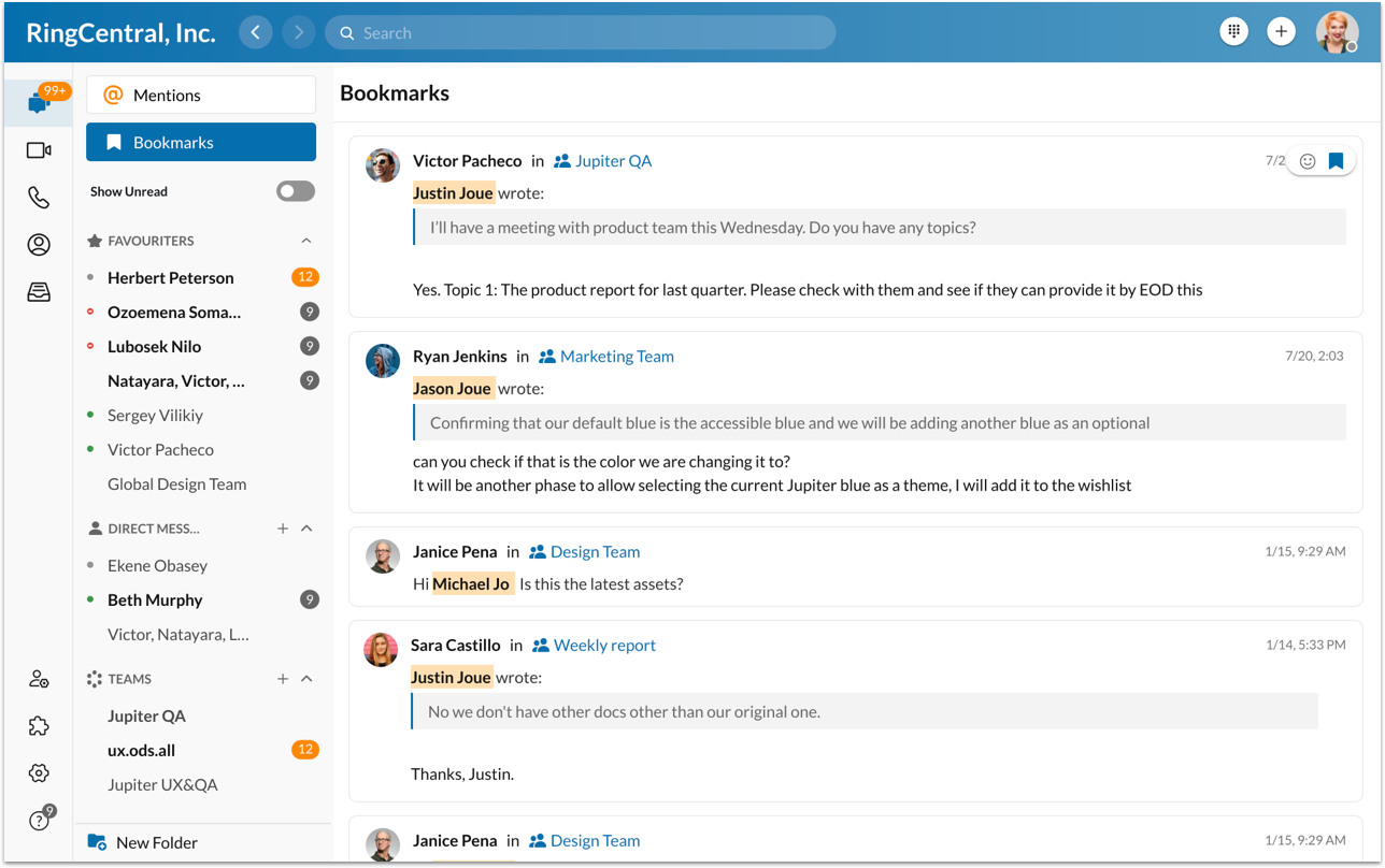
Final design
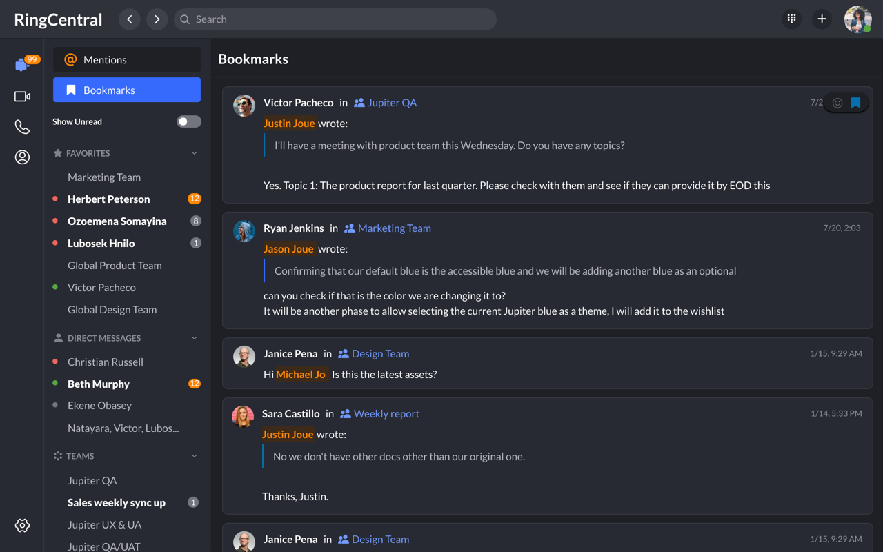
Bookmark light theme
Bookmark dark theme
Global search light theme
Global search dark theme
Key design change
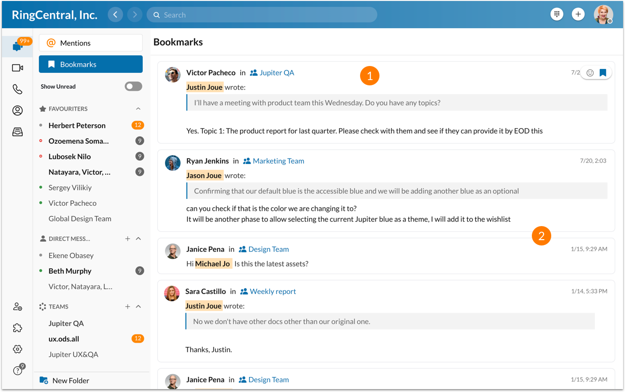
1. User can easily jump to conversation by clicking on the message card - no more button but entire card is clickable.
2. Help user distinguish the message easily by using 'Card' layout.